Kora Financial Inc. The KoraCard
A Virtual Card for College Finance
To jump to the final designs, click here

My Role 🤓
I took our idea and turned it into a real product by working closely with our Senior UX Designer, Product Owner, Product Manager, and Marketing Lead. Here's what I did:
-
I talked to users to understand what they want.
-
I made sure the way users navigate through the new feature is easy and tested it in integration with our other features.
-
I created the virtual card, making sure it is compliant with the guidelines of our bank partners.
-
I designed attractive landing pages and the main website to tell people about this new feature.
The Challenge 🧐
Business Objective:
How might we seamlessly design and integrate a virtual prepaid card within our finance app to enhance user experience and boost the adoption of the company's other services?
User Goal:
From a user standpoint, my goal was to ensure that the overall ecosystem of the Kora app demystifies finance for college students and prepares them for financial responsibilities after graduation through the use of different tools.
Through extensive research into user behaviors and a deep understanding of the app's ecosystem, we crafted the KoraCard tab to seamlessly integrate with KoraCash, offering users a quick route to deposit funds on their KoraCard. This not only enhances the accessibility of our cash loan service but also optimizes cash back rewards, creating a user-centric, efficient experience.
The Solution 💡
How we got there...

1- How will the KoraCard fit within our eco-system? RESEARCH!!!
Together with our marketing lead, we conducted focus groups and co-creation sessions with college students in UCSC and UCLA to understand the average level of financial literacy and how confident they felt about navigating their finances alone.
Focus Groups/Co-Creation Sessions

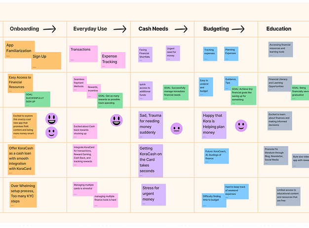
After conducting focus groups, customer surveys and a heuristic evaluation of our current app. I put together a customer journey map to see where and how we can integrate the KoraCard
Journey mapping
On the Product side together with our Kylie Quinn, our senior UX designer, we did research through competitive analysis, gathering screenshots, mocking up flows of other finance apps around the globe to identify market trends, usability insights and to prioritize features.
Competitive Analysis

Initial Explorations
AHA! moments
Uncovering the Challenge:
At the outset, we faced a conundrum. How could KoraCard truly stand out in a market teeming with competitors? Additionally, stringent banking regulations dictated the speed of ACH payment processing. These constraints had our team pondering its unique selling points.
The "Eureka" Moment:
Then, it hit us (during a book club session). KoraCash, with its ability for instant transactions, held the key to setting KoraCard apart. By enticing users to transfer KoraCash to KoraCard, they'd not only enjoy cashback rewards but also boost their credit history. The pieces of the puzzle began to fall into place.
Our journey was twofold.
First, we needed a clear, user-friendly way to convey these benefits to our users.
Second, we had to craft a seamless experience where KoraCash and KoraCard worked in perfect harmony.
Navigating Dual Challenges:


Where should the Card sit in the Nav? Is there a natural user hierarchy? In what order would they need to use Kora's features ( Insights, Card, Cash, and Settings)? Can some be nested?
We had so many things to figure out!

An exciting aspect was ideating on the KoraCard tab and getting requirements on on different states of the virtual card, e.g frozen, deactivated, hidden number, etc.

Designing the card itself had a lot of challenges, following strict guidelines, I pushed the limit as much as I could to make the design stand out.
For the website, we iterated on sitemaps and tested them through cognitive walk-throughs. Even though we wanted to focus on the link between KoraCash and KoraCard, due to bank limitations, they had to be segregated.

We learned to be mindful of how every small change we made affected the entire system. In retrospect, creating a systems blueprint would have been ideal.
Semi-final flows and explorations
Prototyping, Validation, and Accessibility Checks

Among other things, to make sure the hierarchy of our lay out was aligned with the designs goal, we took a few rounds testing with the attention insight plugin to make sure we were on the right track.
We intermittently checked our designs with accessibility plugins to make sure all users will be able to seamlessly use and view our app.
We mostly used Figma plugins to make sure designs adhere to WCAG on the AA level.


Final Designs
The KoraCard


Conclusion
Next Steps:
Our work on integrating the KoraCard with Kora's suite of products has validated our belief that comprehensive financial solutions can significantly benefit our users. next steps we planned on taking were:
-
Extend this approach to other key areas of the platform
-
Focus on enhancing financial literacy
-
Making the app more accessible and easy
to use
Main Challenge and Lesson Learned:
Taking on this project was a tremendous learning opportunity. As a first-time project leader, I initially faced some nerves but quickly learned to trust my dedicated team members. Effective communication and daily stand-up meetings were essential in ensuring the project's success. Learning that every little design change effected the whole ecosystem of the app taught me to learn the difference between what's urgent and what's important.
Results and Impact:
Our integration of the KoraCard with Kora's suite of financial products significantly improved the app's functionality. Users can now seamlessly manage their finances, track expenses, and access cash back rewards, leading to a positive impact on their financial preparedness.
In the Apple Store, Kora boasts an impressive rating of 4.4, while in the Google Play Store, it stands at a solid 4.1.
Visual Assets & illustrations


I led the design process from start to finish, working closely with stakeholders from both Kora and MetaBank. In just one month, I developed a clean, modern design that is easy to use and reflects the values of both companies. The result is a website that is visually appealing, user-friendly, and perfectly suited to the needs of college students."
Website Design
Marketing Product Campaigns


