From surface to system
finding my love for untangling complexity.
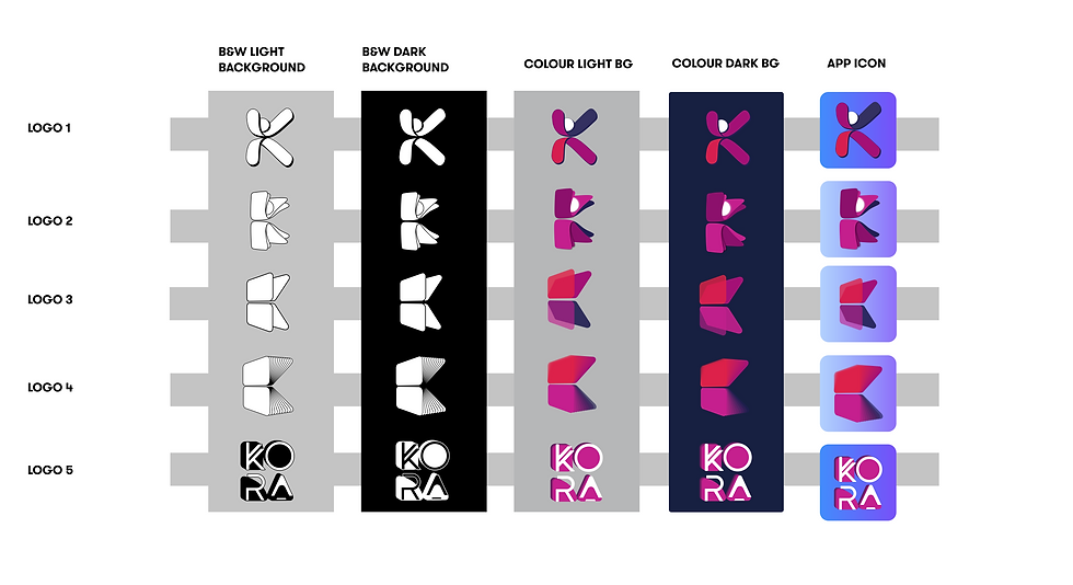
I joined a small fintech startup as a visual designer but left having designed their full rebrand (including a full design system), their first virtual Visa prepaid card, and the foundation of their in-app experience.


Starting With a Dream Brief
I was brought in to lead the company’s full rebrand.
My first months were all about creating a new identity that felt modern (in 2021), trustworthy, and consistent.
As the new identity took shape, it exposed how fragmented the product actually was. Nothing matched, patterns were inconsistent, and flows didn’t align with what users needed.
So alongside the rebrand, I started building my first app design system.
This triggered where my role shifted from “visual polish” to UX and product thinking..


Building my first design system forced me to think about how screens related to each other, and how users should move through the product.
For the first time, I wasn’t just designing what something looked like, but how it worked.
That shift in thinking came at the perfect moment.
The team was getting ready to launch a new prepaid Visa card,and in true startup fashion, I started working on the virtual card UX. A chance to create a real product flow from end to end.
This is where my interest in UX really took off:
a design system sparked the mindset, but designing the virtual card made it real.
Untangling the App Experience(My Systems Thinking Origin Story)
The KoraCard couldn’t live in isolation. To feel coherent, it needed to fit naturally alongside the rest of the product ecosystem: KoraCash (funding + cash-out) and KoraInsights (spend analysis).
When I stepped back to see how all three features connected, the gaps in the overall app experience became impossible to ignore. So I mapped everything end-to-end to understand how the product actually worked and how it should work.

What I mapped
To understand how KoraCard connected with existing features, I mapped:
-
Onboarding
-
KoraCard activation + usage
-
KoraCash flows (funding + withdrawals)
-
KoraInsights (transactions + analysis)
-
Profile & settings
-
Support pathways
This gave me the first holistic view of the ecosystem.
What I found
Scanning all product areas revealed:
Duplicate or conflicting steps across features
Inconsistent states and UI patterns
Security behaviors that varied by feature
Dead-end flows with no clear next step
Logic that didn’t align to real user expectations
The product worked, but it didn’t feel unified.
What I did
To bring the experience together, I:
Consolidated overlapping screens
Standardized patterns across all features
Simplified multi-step flows (especially funding + activation)
Improved hierarchy and readability
Proposed a clearer onboarding structure
Built prototypes to align the team
Prototyping, Validation, and Accessibility Checks

Among other things, to make sure the hierarchy of our lay out was aligned with the designs goal, we took a few rounds testing with the attention insight plugin to make sure we were on the right track.
We intermittently checked our designs with accessibility plugins to make sure all users will be able to seamlessly use and view our app.
We mostly used Figma plugins to make sure designs adhere to WCAG on the AA level.


Impact:
The rebrand landed exactly the way we hoped. It gave the company a modern, trustworthy identity and instantly elevated how customers and partners perceived the product. Even years later, the core visual system I created is still in place. something I quietly (and proudly) confirm whenever I revisit the website.
The design system became the backbone for both the marketing site and the app, helping the team ship more consistently and communicate with one coherent voice. Engineers finally had reusable patterns, and new features could plug into a structure instead of starting from scratch.
Bringing KoraCard, KoraCash, and KoraInsights into one unified flow also created clarity the product hadn’t had before. Users finally had a predictable experience, and the team had a common understanding of how the app should behave.
the rebrand shaped the brand, the system shaped the product, and the product work shaped the user experience.
Reflection:
This job flipped a switch for me. I came for the rebrand, but discovered a passion for structure, clarity, and fixing the things users feel long before they see. It set the foundation for the designer I am now: The one who moves fast, thinks deeply, and thrives in complexity.


Final Designs
The Kora App and the KoraCard


Website Design
I led the design process from start to finish, working closely with stakeholders from both Kora and MetaBank. In just one month, I developed a clean, modern design that is easy to use and reflects the values of both companies. The result is a website that is visually appealing, user-friendly, and perfectly suited to the needs of college students.
End of year Finance Recap


